Data Visualization Charts Presentation – Free Template Download
- Techriv
- March 27, 2024
- Entrepreneurship
- 0 Comments
Introduction
At the outset, data visualization charts presentation stands as a cornerstone in our data-driven landscape. It serves as the bridge between complexity and clarity, enabling us to distill intricate datasets into easily understandable insights. Through the strategic use of visual representations like charts, graphs, and maps, data visualization empowers us to extract valuable insights, make informed decisions, and communicate findings effectively. Whether dissecting departmental spending, tracking advertising revenue growth, or projecting market trends, data visualization charts presentation plays a pivotal role in guiding our understanding and facilitating meaningful action.
Download this presentation:
Download Powerpoint PPT
Download Google Slides
Download Apple Keynote
Highlights


Download Data Visualization Presentation:
Download Powerpoint PPT
Download Google Slides
Download Apple Keynote
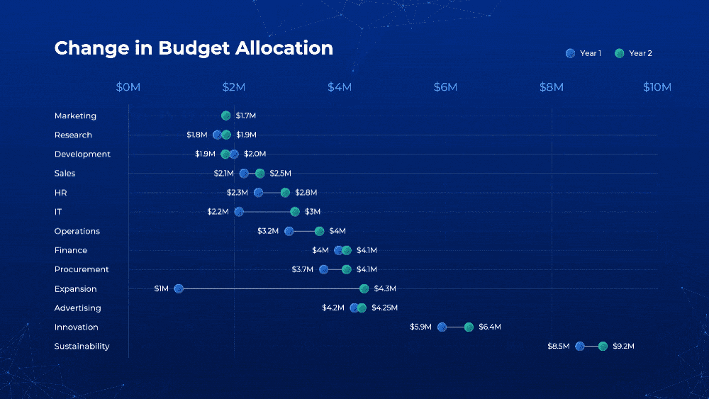
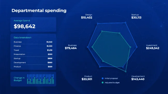
Departmental Spending PPT
In this departmental spending visualization, we delve into the intricate details of budget allocation within various departments. Through clear and insightful data visualization, viewers can easily grasp how resources are distributed across different sectors. Understanding departmental spending is crucial for strategic planning and resource optimization within organizations. By visualizing this data, stakeholders can identify trends, anomalies, and areas for potential improvement, leading to more informed decision-making processes.
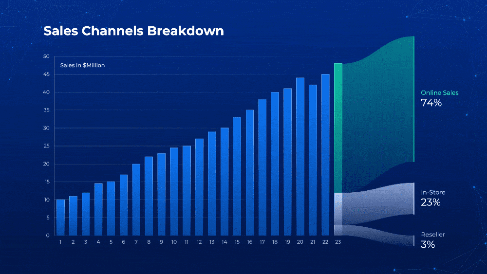
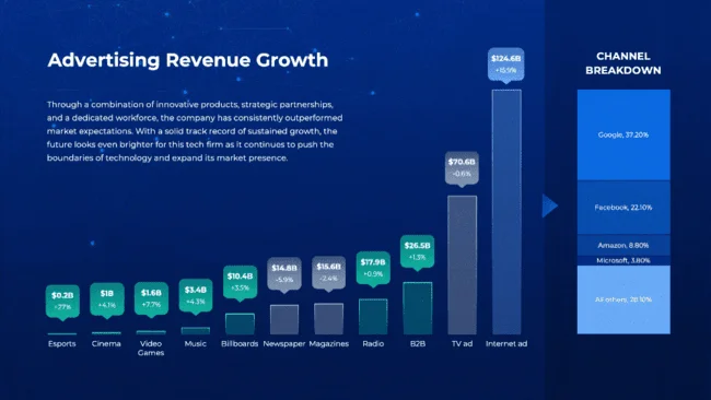
Advertising Revenue Growth
Witness the dynamic journey of advertising revenue growth through our visually engaging presentation. By employing effective data visualization techniques, we illuminate the trajectory of revenue growth over time, highlighting key milestones and factors influencing this upward trend. Understanding advertising revenue growth is paramount for businesses seeking to maximize their profits and market share.
Our visualization provides valuable insights into market dynamics, consumer behavior, and the effectiveness of advertising strategies, empowering businesses to make informed decisions and drive sustainable growth.
Download this presentation template:
Download Powerpoint PPT
Download Google Slides
Download Apple Keynote
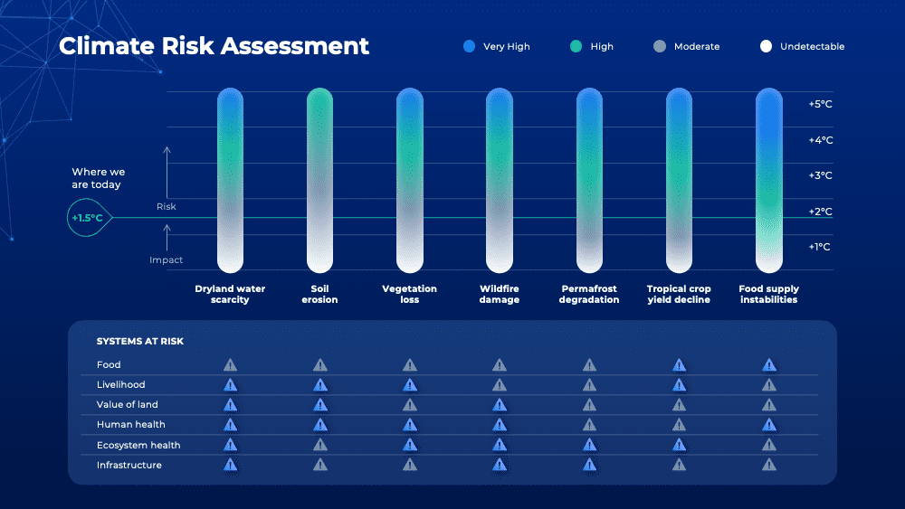
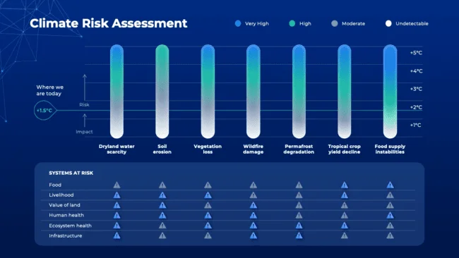
Climate Risk Assessment
Explore the complexities of climate risk assessment through our comprehensive data visualization. By visually representing climate-related data, such as Dryland water scarcity, Soil erosion, Wildfire damage etc, we shed light on the potential risks and vulnerabilities faced by communities and ecosystems.
Climate risk assessment is essential for policymakers, businesses, and individuals alike, enabling proactive measures to mitigate adverse impacts and build resilience against climate change. Our visualization facilitates a deeper understanding of these risks, fostering informed decision-making and sustainable adaptation strategies.
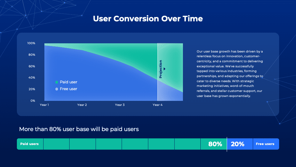
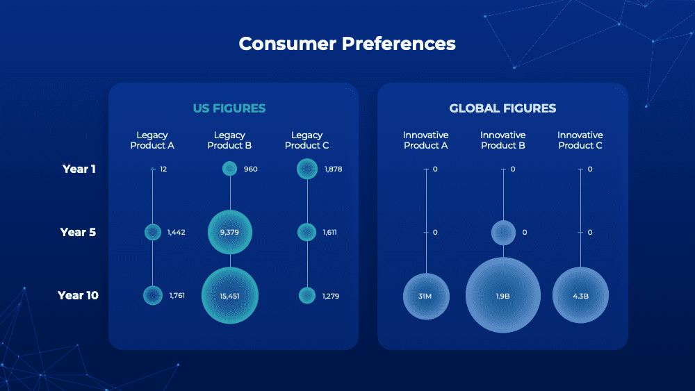
Demographic Shift
Uncover the transformative power of demographic shifts with our insightful data visualization. By visualizing demographic trends, such as population growth, age distribution, and migration patterns, we provide valuable insights into societal changes and their implications for various sectors. Understanding demographic shifts is crucial for businesses, policymakers, and researchers to anticipate future trends, tailor products and services, and address emerging needs and challenges. Our visualization offers a compelling narrative of demographic dynamics, empowering stakeholders to navigate an ever-evolving landscape with confidence and foresight.

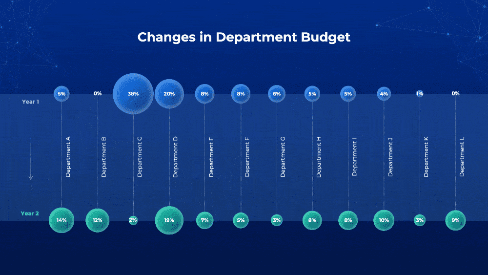
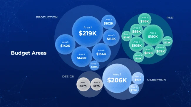
Budget Areas
Dive into the intricacies of budget allocation with our comprehensive visualization of budget areas. By visually representing expenditure across different budget categories, we provide stakeholders with valuable insights into spending patterns, priorities, and areas of investment. Understanding budget areas is essential for policymakers, organizations, and individuals to ensure efficient resource allocation and fiscal accountability. Our visualization facilitates data-driven decision-making, enabling stakeholders to optimize budgetary decisions and achieve their strategic objectives effectively.
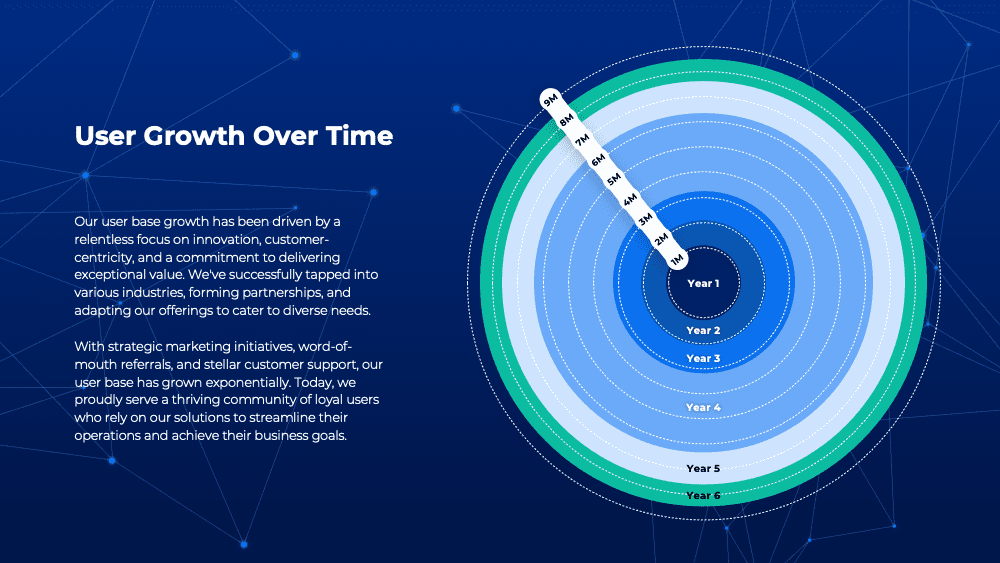
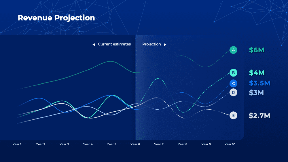
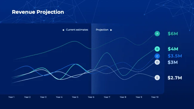
Revenue Projection Template
Embark on a journey of financial foresight with our revenue projection visualization. Through clear and intuitive data visualization, we present projections of future revenue based on historical trends, market analysis, and strategic assumptions. Revenue projection is essential for businesses to set realistic goals, allocate resources effectively, and make informed investment decisions. Our visualization provides stakeholders with valuable insights into potential revenue streams, growth opportunities, and risk factors, enabling them to devise robust business strategies and achieve sustainable financial success.
Data Visualization Template
Data visualization is the art of transforming raw data into visual representations such as charts, graphs, and maps, making complex information more understandable and accessible. It plays a crucial role in helping businesses and individuals analyze data trends, identify patterns, and make informed decisions. By presenting data visually, insights can be quickly gleaned, enabling faster and more accurate decision-making processes. We’ll explore the fundamentals of data visualization, its importance, and how it can be effectively utilized to unlock valuable insights from data.
Real-Life Examples:
Data visualization charts has made a significant impact. From healthcare organizations leveraging visualization to analyze patient outcomes to retail companies utilizing it to understand consumer behavior, these real-life examples underscore the versatility and efficacy of data visualization charts in extracting diverse insights from disparate datasets.
Insights and Essential Elements:
1. Trends Identification: Visualizing data over time allows for the easy identification of trends and patterns. Whether it’s discerning seasonal fluctuations in sales or detecting long-term demographic shifts, data visualization makes trends readily apparent.
2. Correlation Discovery: Through visual representations, relationships between different variables become clear. Data visualization enables the analysis of correlations between factors such as advertising expenditure and revenue growth or environmental factors and consumer behavior.
3. Anomaly Detection: Effective data visualization quickly highlights anomalies or outliers within datasets. These anomalies may indicate potential issues or opportunities, such as irregularities in departmental spending or unexpected fluctuations in market projections.
4. Comparative Analysis: Visualizing data side by side facilitates comparative analysis across departments, regions, or time periods. This insight aids in resource allocation decisions, identifying areas of strength or weakness, and guiding strategic planning efforts.
5. Predictive Insights: By analyzing historical data and trends, data visualization can provide insights into future outcomes. Revenue projections, market forecasts, and risk assessments are examples of how visualization techniques can anticipate future scenarios and inform proactive decision-making.
Download Data Visualization Charts Presentation:
Download Powerpoint PPT
Download Google Slides
Download Apple Keynote