How do I create a pivot table to analyze data in Excel or Google Sheets?
A pivot table is a powerful tool that allows users to summarize, analyze, explore, and present large amounts of data quickly. To create a pivot table in Excel, go to the “Insert” tab and select “PivotTable.” Choose the data range and where you want the pivot table to appear. Then, drag and drop fields into the Rows, Columns, Values, and Filters areas to customize your analysis. In Google Sheets, go to “Data” > “Pivot table,” select the data range, and then configure the rows, columns, and values as needed. Pivot tables are particularly useful for generating reports, identifying trends, and summarizing complex datasets.
Question related to this spreadsheet:
Ultimate Charts Spreadsheet
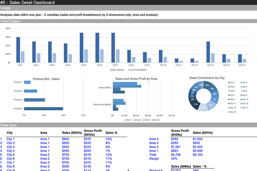
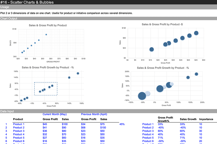
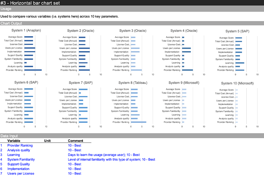
The Ultimate Charts Spreadsheet offers a comprehensive collection of spreadsheet templates designed to simplify the process of creating and utilizing charts in various applications. With two parts comprising different built-in types of charts, including waterfalls, pie charts, stacked areas, histograms, and treemaps, this collection aims to save users time and effort while enhancing their data visualization capabilities. Additionally, chart collages and dashboards are available, providing users with versatile tools for organizing and presenting their data effectively.
Download this spreadsheet:
Download Excel Format
Copy Google Sheet
Spreadsheet Preview


Download Ultimate Charts Spreadsheet:
Download Excel Format
Copy Google Sheet
Related:
Event Planner Spreadsheet
Employee Scheduler Spreadsheet
Project Plan Spreadsheet
Data Visualization Charts